CSS3新特性
过渡
transition: CSS属性,花费时间,效果曲线(默认ease),延迟时间(默认0)
<style>
#box{
  width:100px;
  height:100px;
  background-color:#00abfe;
  /* width属性以1s的时间变化 */
  transition: width 1s;
}
#box:hover{
  width:500px;
}
</style>

<div id="box"></div>
动画
animation: 动画名称,一个周期花费的时间,运动曲线(默认ease),动画延迟(默认0),播放次数(默认1),是否反向播放(默认normal),是否暂停动画(默认running)
/* 执行一次logo2-line动画,运动时间2s,运动曲线为linear */
animation: logo2-line 2s linear;

/*无限执行logo2-line动画,每次运动时间2秒,运动曲线为 linear,并且执行反向动画*/
animation: logo2-line 2s linear alternate infinite;
还有一个重要属性
animation-fill-mode : none | forwards | backwards | both;
/*none:不改变默认行为。
forwards :当动画完成后,保持最后一个属性值(在最后一个关键帧中定义)。
backwards:在 animation-delay 所指定的一段时间内,在动画显示之前,应用开始属性值(在第一个关键帧中定义)。
both:向前和向后填充模式都被应用。  */
形状转换
transform:适用于2D或3D转换的元素 transform-origin:转换元素的位置(围绕哪个点进行转换,默认(50%,50%,0))
<style>
  .box{
    width:60px;
    height:60px;
    background-color:#00abfe;
    margin: 30px 0;
  }
</style>
<div style="padding:20px;">
  <span>旋转30度:transform:rotate(30deg)</span>
  <div class="box" style="transform:rotate(30deg);"></div>
  <span>水平旋转30度:transform:rotateX(180deg)</span>
  <div class="box" style="transform:rotateX(180deg);"></div>
  <span>竖直旋转30度:transform:rotateY(180deg)</span>
  <div class="box" style="transform:rotateY(180deg);"></div>
  <span>三个方向各90度:transform:rotate3d(1,1,1,90deg)</span>
  <div class="box" style="transform:rotate3d(1,1,1,90deg);"></div>
  <span>水平竖直平移30px:transform:translate(30px,30px)</span>
  <div class="box" style="transform:translate(30px,30px);"></div>
  <span>缩放到0.8:transform:scale(.8)</span>
  <div class="box" style="transform:scale(.8);"></div>
  <span>倾斜10度:transform: skew(10deg,10deg)</span>
  <div class="box" style="transform: skew(10deg,10deg);"></div>
</div>
选择器
阴影
box-shadow:水平阴影的位置 垂直阴影的位置 模糊距离 阴影的大小 阴影的颜色 阴影开始的方向(默认从里往外,设置inset就是从外往里);
<style>
#box{
  width:100px;
  height:100px;
  background-color:#00abfe;
  box-shadow: 40px 40px 40px 10px #cdcdcd
}
</style>

<div id="box"></div>
边框
边框图片
border-image: 图片url 图像边界向内偏移量 图像边界的宽度(默认为边框的宽度) 用于指定在边框外部绘制偏移的量(默认0) 铺满方式(默认:拉伸stretch,还有重复repeat、铺满round)
边框圆角
border-radius: n1,n2,n3,n4;
n1-n4四个值的顺序是:左上角,右上角,右下角,左下角
<style>
#box{
  width:100px;
  height:100px;
  background-color:#00abfe;
  border-radius: 30px;
}
</style>

<div id="box"></div>
背景
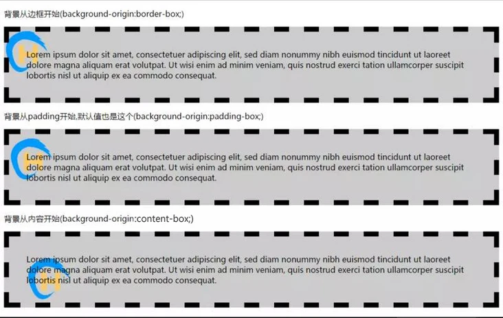
设定背景区域
background-clip:默认border-box,可以改成padding-box、content-box
设置背景起点
background-Origin:border-box、padding-box或content-box
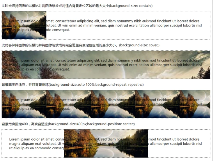
设置背景大小
background-size: contain、cover、auto、100% 100%...
设置多背景
,分隔即可。
例如:background:url('test.jpg') no-repeat left, url(logo.png) no-repeat right;
倒影(反射)
-webkit-box-reflect:方向(above上|below下|right右|left左),偏移量,用于反射的蒙版(图片)。
文字
换行
word-break: normal默认|break-all只能在半角空格或连字符处换行|keep-all在单词内换行
<style>
  .box{
    width:200px;
    height:200px;
    overflow:hidden;
    border:1px solid #000;
    margin:10px;
  }
</style>
<div style="display:flex;">
  <div>
    <span>word-break: normal;</span>
    <div class="box" style="word-break: normal;">The lawn started at the beach and ran toward the front door for a quarter of a mile, jumping over sundials and brick walks and burning gardens - finally when it reached the house drifting up the side in bright vines as though from the momentum of its run. The front was broken by a line of French windows, glowing now with reflected gold and wide open to the warm windy afternoon.</div>
  </div>
  <div>
    <span>word-break: keep-all;</span>
    <div class="box" style="word-break: keep-all;">The lawn started at the beach and ran toward the front door for a quarter of a mile, jumping over sundials and brick walks and burning gardens - finally when it reached the house drifting up the side in bright vines as though from the momentum of its run. The front was broken by a line of French windows, glowing now with reflected gold and wide open to the warm windy afternoon.</div>
  </div>
  <div>
    <span>word-break: break-all;</span>
    <div class="box" style="word-break: break-all;">The lawn started at the beach and ran toward the front door for a quarter of a mile, jumping over sundials and brick walks and burning gardens - finally when it reached the house drifting up the side in bright vines as though from the momentum of its run. The front was broken by a line of French windows, glowing now with reflected gold and wide open to the warm windy afternoon.</div>
  </div>
</div>
word-wrap: normal(默认)| break-word
<style>
  .box{
    width:200px;
    height:200px;
    border:1px solid #000;
    margin:10px;
  }
</style>
<div style="display:flex;">
  <div>
    <span>word-wrap: normal;</span>
    <div class="box" style="word-wrap: normal;">The lawn started at the beach and ran toward the front door for a quarter offfffffffffffffffffffffffofff a mile</div>
  </div>
  <div>
    <span>word-wrap: break-word;</span>
    <div class="box" style="word-wrap: break-word;">The lawn started at the beach and ran toward the front door for a quarter offfffffffffffffffffffffffofff a mile</div>
  </div>
</div>
超出省略号
text-overflow: clip|ellipsis|string,clip这个方式处理不美观,不优雅。string只在火狐兼容。
<style>
  .box{
    overflow:hidden;
    text-overflow:ellipsis;
    white-space:nowrap;
  }
</style>
<div class="box">The lawn started at the beach and ran toward the front door for a quarter of a mile, jumping over sundials and brick walks and burning gardens - finally when it reached the house drifting up the side in bright vines as though from the momentum of its run. The front was broken by a line of French windows, glowing now with reflected gold and wide open to the warm windy afternoon.</div>
多行超出省略号
<style>
  .box{
      overflow:hidden;
      text-overflow:ellipsis;
      display: -webkit-box;
      -webkit-line-clamp: 2;
      -webkit-box-orient: vertical;
  }
</style>
<div class="box">The lawn started at the beach and ran toward the front door for a quarter of a mile, jumping over sundials and brick walks and burning gardens - finally when it reached the house drifting up the side in bright vines as though from the momentum of its run. The front was broken by a line of French windows, glowing now with reflected gold and wide open to the warm windy afternoon.</div>
文字阴影
text-shadow: 水平阴影,垂直阴影,模糊的距离,以及阴影的颜色。
<style>
  .box{
    text-shadow: 10px 10px 10px #000
  }
</style>
<div class="box">The lawn started at the beach and ran toward the front door for a quarter of a mile, jumping over sundials and brick walks and burning gardens - finally when it reached the house drifting up the side in bright vines as though from the momentum of its run. The front was broken by a line of French windows, glowing now with reflected gold and wide open to the warm windy afternoon.</div>
颜色
表示形式
rgba/hsla
渐变
CSS3 Gradient
再说CSS3渐变——线性渐变
再说CSS3渐变——径向渐变
神奇的 conic-gradient 圆锥渐变(这篇就是看我看到圆锥渐变的文章)
滤镜
filter: grayscale灰度/sepia(褐色)/saturate(饱和度)/hue-rotate(色度旋转)/invert(反色)/opacity(透明度)/brightness(亮度)/contrast(对比度)/blur(模糊度)/drop-shadow(阴影)
flex弹性布局
网格布局
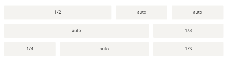
<style>
  .grid {
    display: flex;
    flex-wrap: wrap;
  }

  .grid-row {
    width:100%;
    display: flex;
  }

  .grid-cell {
    flex: 1;
    background: #ccc;
    box-sizing: border-box;
    padding: 10px;
    background-clip: content-box;
  }

  .u-1of2 {
    flex: 0 0 50%;
  }

  .u-1of3 {
    flex: 0 0 33.3%;
  }

  .u-1of4 {
    flex: 0 0 25%;
  }
</style>
<div class="grid">
  <div class="grid-row">
    <div class="grid-cell u-1of2">...</div>
    <div class="grid-cell">...</div>
    <div class="grid-cell">...</div>
  </div>
  <div class="grid-row">
    <div class="grid-cell">...</div>
    <div class="grid-cell u-1of3">...</div>
  </div>
  <div class="grid-row">
    <div class="grid-cell u-1of4">...</div>
    <div class="grid-cell">...</div>
    <div class="grid-cell u-1of3">...</div>
  </div>
</div>
圣杯布局
圣杯布局(Holy Grail Layout)指的是一种最常见的网站布局。页面从上到下,分成三个部分:头部(header),躯干(body),尾部(footer)。其中躯干又水平分成三栏,从左到右为:导航、主栏、副栏。
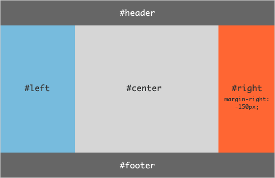
HTML代码如下。
<style>
.container {
  display: flex;
  min-height: 100vh;
  flex-direction: column;
}
header,footer {
  flex: 1;
}

.holygrail-body {
  display: flex;
  flex: 1;
}

.holygrail-content {
  flex: 1;
}

.holygrail-nav, .holygrail-ads {
  /* 两个边栏的宽度设为12em */
  flex: 0 0 12em;
}

.holygrail-nav {
  /* 导航放到最左边 */
  order: -1;
}

/* 如果是小屏幕,躯干的三栏自动变为垂直叠加。 */
@media (max-width: 768px) {
  .holygrail-body {
    flex-direction: column;
    flex: 1;
  }
  .holygrail-nav,
  .holygrail-ads,
  .holygrail-content {
    flex: auto;
  }
}
</style>
<div class="container">
<header>header</header>
  <div class="holygrail-body">
    <main class="holygrail-content">content</main>
    <nav class="holygrail-nav">nav</nav>
    <aside class="holygrail-ads">abs</aside>
  </div>
  <footer>footer</footer>
</div>
grid栅格布局
多列布局
这个属性,建议加私有前缀,兼容性有待提高! 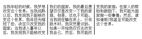
<head>
  <style>
.newspaper{
    column-count: 3;
    -webkit-column-count: 3;
    -moz-column-count: 3;
    column-rule:2px solid #000;
    -webkit-column-rule:2px solid #000;
    -mox-column-rule:2px solid #000;
}
</style>
</head>
<div class="newspaper">
当我年轻的时候,我梦想改变这个世界;当我成熟以后,我发现我不能够改变这个世界,我将目光缩短了些,决定只改变我的国家;当我进入暮年以后,我发现我不能够改变我们的国家,我的最后愿望仅仅是改变一下我的家庭,但是,这也不可能。当我现在躺在床上,行将就木时,我突然意识到:如果一开始我仅仅去改变我自己,然后,我可能改变我的家庭;在家人的帮助和鼓励下,我可能为国家做一些事情;然后,谁知道呢?我甚至可能改变这个世界。
</div>
盒模型定义
border-box/content-box/padding-box
媒体查询
<style>
body {
    background-color: pink;
}
@media screen and (max-width: 960px) {
    body {
        background-color: darkgoldenrod;
    }
}
@media screen and (max-width: 480px) {
    body {
        background-color: lightgreen;
    }
}
</style>

<h1>重置浏览器窗口查看效果!</h1>
<p>如果媒体类型屏幕的可视窗口宽度小于 960 px ,背景颜色将改变。</p>
<p>如果媒体类型屏幕的可视窗口宽度小于 480 px ,背景颜色将改变。</p>
混合模式
css3的混合模式,两个(background-blend-mode和mix-blend-mode)。这两个写法和显示效果都非常像!区别就在于background-blend-mode是用于同一个元素的背景图片和背景颜色的。mix-blend-mode用于一个元素的背景图片或者颜色和子元素的。
文章来源:css3新特性